Cook Local, Eat Global
Easy Artful Plate Design
One of the things I like best about working in a restaurant is that it simply isn’t enough to make food that tastes great–it also has to look good.
Everyone eats first with their eyes (and arguably, with their noses), long before the first morsel passes their lips. And there are few things more satisfying to a server or chef than to see guests’ eyes light up when beautiful plates are set before them, steam writhing upwards in an enticing dance, carrying delectable aromas forth.
People become excited when they see food that is colorful arranged on a plate in an artful, thoughtful manner. The greatest chefs present delicate morsels arrayed like sparkling gems on pristine plates painted with vibrant colored sauces. This sort of presentation is an art form, with architectural elements made of edibles, stacked layers of different textures and flavors combined for gustatory as well as visual impact, and requires a great deal of skill that is often beyond the abilities of most home cooks.
And while I am capable of such presentation, and appreciate it, it is not how I choose to present my own creations. It is too fussy for me, and as beautiful as I find the works of Eric Ripert to behold (I still haven’t tasted his food, although Morganna, lucky wench, has and she tells me that his dishes are as heavenly on the tongue as they are delightful to the eyes), my own aesthetic is informed by the food and cooking I grew up with on the farm in West Virginia. I guess you can take the girl out of the hills, but the hillbilly still remains, deep in her heart, expressing itself in small, unexpected ways.
My own culinary aesthetic is for ethnic home cooking–multi-cultural soul food, if you will–presented simply, but beautifully, in a way that is respectful to the cultures which originated it, while still allowing playful personal experimentation.
And when presenting these comforting foods simply, that doesn’t mean I just slop some stuff on a plate and call it done–I like to make my food, particularly at Salaam look just as good as it tastes. But, I am not going to sit and build a stack of dinner on a plate, either, because I want my guests to be comfortable with their food. In many cases at Salaam, when we present the foods of the Silk Road, we are already venturing outside of many of our guests comfort zone, by giving them unfamiliar ingredients and dishes from places many of them may not have ever heard of, or thought about at all.
In such cases, it is best to give the guests something to hold on to–a touchstone that they can relate to. And so my more casual, but still beautiful, plate design is that touchstone. I don’t give them food that they may have to puzzle out how to eat it, I just present them with food that is about what they would get in someone’s home, only I have gussied it up a bit.
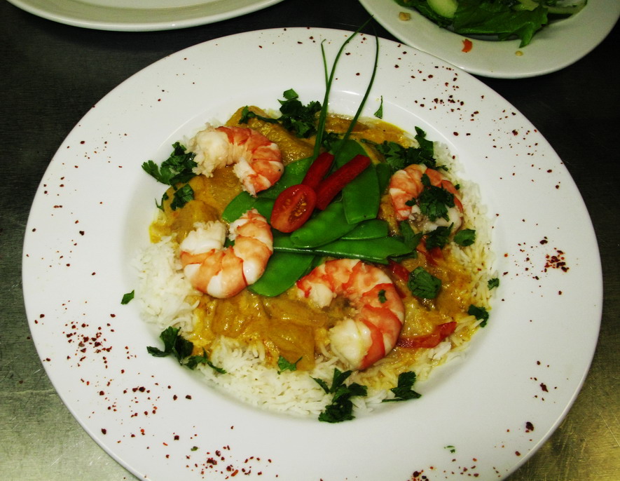
There are some principles to my seemingly loosey-goosey method of casual plate design. I like a balance in colors, which you can see in both of these Thai coconut milk curries. The yellow curry in the first picture has primarily warm colors from the turmeric-colored curry, the pink shrimp, the tomatoes, mangoes and sweet red peppers, but this is balanced with the fresh cool shades of green from the cilantro, chives and snow pea pods. The white rice and plate make a nice, neutral canvas for the brilliant colors of the ingredients–and of course, steamed jasmine rice is the traditional starch served with the curry.
Contrasting or complementary colors make a plate pop–that is something to keep in mind. Look at the red pepper and tomato on top of the pile of snow peas in the first photograph. They look yummy, not only because they are yummy, but because red and green are complementary colors–opposites on the color wheel. Red, yellow and blue are primary colors; orange, green and purple are secondary colors made of a combination of two primary colors. Green is a combination of yellow and blue–what makes it complementary to red is that it lacks red in its makeup. Orange is blue’s complement and purple is yellow’s. For plate designs that really stand out–try and use complementary colors next to or on top of each other.
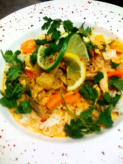
Colors that are next to each other on the color wheel make for a harmonious look. This is exemplified in the second photograph–the warm colors red, orange and yellow colors abound in this plate, making it all harmonious. The only cool color is green from the cilantro and lime slice, although the lime slice is a yellowish green, making it a warmer green than the cooler, bluer cilantro. The use of primarily warm colors makes this plate look happy, harmonious and cheerful, and the deep, cooler green of the cilantro pops in contrast to the reds, yellows and oranges, while the lime just fits right in with them.
I also like to use both symmetry and asymmetry in my plate design. As you can see in both photographs, symmetry is very pleasing to the human eye. Look at how the shrimp are arrayed in a circle, all pointing in the same direction, so the curves of the shrimp give a sense of motion to the composition. This radial symmetry exists in nature all over the place–look at daisies and other compound flowers, or the markings on a sand dollar. I like echoing the natural world on my plates–it is a harmonious design that is calming to the human psyche.
The lemon and lime slices twisted and placed carefully atop each other in the second photograph of the red curry chicken also echoes the radial symmetry of a flower. These are sprinkled with brilliant scarlet pepper flakes to give a contrast in color which reminds me of the freckles in the throat of a lily blossom.
Asymmetry comes in with the yellow curry. Note that I put two chive leaves in the center. They are of differing lengths, and while they stick up from the plate and offer a sense of height, they are not the same height. They also point in the same basic direction, so they introduce an element of asymmetry into the otherwise almost perfectly symmetrical design. This adds and element of movement, and it draws the eye toward the center of the plate where the beautiful emerald green snow peas are piled in a casual, imperfect conical shape.
On the red curry plate, you can see I tucked a sprig of cilantro under the citrus “flower” to once again add a sense of height and a random, asymmetrical element.
These casual “rules” of plate design can be used by any home cook to make their foods look better. And, if a dish looks better, I have found that it often tastes better–because, as I noted at the beginning of this post–people eat first with their eyes, then their noses, and finally with their mouths.
So there we are. Think about a balance of colors, a sense of movement and height and the pleasant effect of symmetry contrasted with the surprising element of a touch of asymmetry when you present your guests at home with a delicious dinner. You may find that with a little bit of thought and care that your food will not only look better, it will taste better too.
7 Comments
RSS feed for comments on this post.
Sorry, the comment form is closed at this time.

Categories:
- Admin (rss) (55)
- Blogs and Blogging (rss) (81)
- Book Reviews: Cookbooks (rss) (43)
- Book Reviews: Non-Cookbook Food Books (rss) (38)
- Cats and Cat Blogging (rss) (47)
- Chinese Cooking Lessons (rss) (32)
- Culinary School Stories (rss) (18)
- Dairy Pruducts: Cultured and Barbaric (rss) (4)
- Documentary Filmmaking (rss) (1)
- Essays, Rants and Reflections (rss) (260)
- Fighting Hunger (rss) (12)
- Food and Kids (rss) (45)
- Food in the News (rss) (126)
- Food Media (rss) (98)
- Food Preservation (rss) (18)
- Food Safety (rss) (45)
- Gardening (rss) (30)
- Herbs and Herb Blogging (rss) (20)
- Holidays (rss) (50)
- Kat Blogging (rss) (22)
- Kitchen Science (rss) (36)
- Leftover Makeover (rss) (8)
- Life, the Universe and Everything (rss) (131)
- Local and Sustainable (rss) (227)
- Local Athens Food and Foodies (rss) (42)
- Meatless Mondays (rss) (32)
- Menu For Hope (rss) (5)
- Nutrition, Diet and Health (rss) (84)
- On The Farm (rss) (8)
- Recipes: Almost Vegetarian, Vegetarian and Vegan (rss) (294)
- Recipes: American Regional (rss) (37)
- Recipes: Appalachian Hillbilly (rss) (33)
- Recipes: Bread, Pasta, Grains (rss) (95)
- Recipes: Canning and Preserving (rss) (8)
- Recipes: Chinese (rss) (123)
- Recipes: Comfort Food (rss) (120)
- Recipes: Cookies (rss) (16)
- Recipes: Desserts (rss) (48)
- Recipes: French (rss) (25)
- Recipes: Fruits and Vegetables (rss) (302)
- Recipes: Greek, North African and Middle Eastern (rss) (31)
- Recipes: Indian (rss) (137)
- Recipes: Italian (rss) (42)
- Recipes: Japanese (rss) (7)
- Recipes: Jewish (rss) (4)
- Recipes: Korean (rss) (6)
- Recipes: Meat, Poultry and Fish (rss) (220)
- Recipes: Mexican/Native American/ Latin American/Caribb (rss) (27)
- Recipes: Original (rss) (108)
- Recipes: Thai (rss) (27)
- Recipes: Tofu (rss) (17)
- Recipes: US Regional (rss) (16)
- Recipes: Vietnamese (rss) (8)
- Restaurant Stories (rss) (28)
- Sewing, Quilting, Arts and Crafts (rss) (16)
- Simple Chinese Recipes (rss) (30)
- Slow Food and Heritage Foods (rss) (10)
- Spice Blogging (rss) (44)
- The Chinese Cookbook Project (rss) (14)
- The Chinese Pantry (rss) (39)
- The Documentary (rss) (2)
- The Kitchen Saga (rss) (17)
- The Locavore's Bookshelf (rss) (15)
- The Unsung Adventures of The Culinary Nerd (rss) (6)
- Tools and Toys (rss) (35)
- Uncategorized (rss) (10)
- With a Side of Politics (rss) (48)
Archives:
- August 2012 (9)
- July 2012 (12)
- September 2011 (3)
- August 2011 (7)
- July 2011 (8)
- June 2011 (16)
- May 2011 (17)
- April 2011 (11)
- December 2010 (9)
- November 2010 (5)
- February 2010 (1)
- December 2009 (5)
- November 2009 (7)
- October 2009 (10)
- September 2009 (16)
- August 2009 (14)
- July 2009 (14)
- June 2009 (7)
- May 2009 (17)
- April 2009 (10)
- March 2009 (25)
- February 2009 (13)
- January 2009 (10)
- December 2008 (5)
- November 2008 (5)
- October 2008 (6)
- September 2008 (13)
- August 2008 (8)
- July 2008 (11)
- June 2008 (18)
- May 2008 (13)
- April 2008 (14)
- March 2008 (16)
- February 2008 (17)
- January 2008 (19)
- December 2007 (25)
- November 2007 (18)
- October 2007 (24)
- September 2007 (16)
- August 2007 (15)
- July 2007 (15)
- June 2007 (10)
- May 2007 (14)
- April 2007 (16)
- March 2007 (17)
- February 2007 (20)
- January 2007 (13)
- November 2006 (1)
- October 2006 (8)
- September 2006 (14)
- August 2006 (25)
- July 2006 (30)
- June 2006 (28)
- May 2006 (34)
- April 2006 (29)
- March 2006 (24)
- February 2006 (30)
- January 2006 (38)
- December 2005 (40)
- November 2005 (37)
- October 2005 (32)
- September 2005 (25)
- August 2005 (30)
- July 2005 (28)
- June 2005 (21)
- May 2005 (8)
- April 2005 (22)
- March 2005 (17)
- February 2005 (29)
- January 2005 (10)
Search Site:
Links:
- Lily’s Wai Sek Hong
- 101 Cookbooks
- A cat in the kitchen
- A Veggie Venture
- Accidental Hedonist
- Cha Xiu Bao
- chez pim
- Chocolate & Zucchini
- Chopstick Cinema
- Chowhound.com
- Chubby Hubby
- Cook sister!
- Cooking with Amy
- da*xiang
- Eat Local Challenge
- Eating Liberally
- Ecocentric
- Eggbeater
- Epicurious
- Farmgirl Fare
- Fatfree Vegan
- Foodgoat
- ForkandBottle.com
- Green Olive Tree
- Hooked on Heat
- Jaden’s Steamy Kitchen
- Kalyn’s Kitchen
- Lucullian delights
- Mahanandi
- Matt Bites
- MeatHenge
- mmm-yoso!!!
- New York Times – Dining & Wine
- Pizza Goon
- Rasa Malaysia
- Ruhlman
- Sailu's Kitchen
- Serious Eats
- SF Gate: Food & Dining
- Simply Recipes
- Soul Fusion Kitchen
- Tastespotting
- The Amateur Gourmet
- The Cleaner Plate Club
- The Food Section
- The Grub Report
- thecookscottage
- U.S. Food Policy
- Wandering Chopsticks
- Washington Post Food and Dining
- Wasted Food
Meta:

Powered by WordPress. Graphics by Zak Kramer.
Design update by Daniel Trout.
Entries and comments feeds.
My strongest and most unexpected lesson in Cooking 101 at CHIC in Chicago was that looks count. As a home cook I hadn’t thought about presentation much, at CHIC I was graded on it. Now I routinely plate food differently.
(The other strong lesson was how much Chef John and I disagreed on the use of salt. He always wanted me to use more than I did. I generally took the point off rather than add too much.)
Comment by Harry — April 25, 2008 #
“Everyone eats first with their eyes…”
Almost everyone. 🙂
http://xkcd.com/386/
Comment by prac — April 25, 2008 #
I wonder what you feel about the phenomenon of Too Pretty to Eat syndrome. 🙂
It’s something I’ve suffered from on the few occassions I get a fancy meal. It seems to be a particular problem with desserts. I’ve actually caused this problem myself with some desserts… having them sit there untouched until I finally ask the guests to please cut into the cake and eat it instead of just looking at it!
It seems you have a good balanced attitude here with making food look enticing without making diners feel bad about sticking a fork into a delicate work of art.
Comment by Neohippie — April 25, 2008 #
Ahh if only the frozen dinners would look the same when you open up the package as they do on the box. The marketing folks definately have mastered the concept of “artful plate design.”
Comment by vegoftheweek — April 25, 2008 #
Thanks for the informative post on food plating. It is something that I think is important, but struggle with sometimes.
Comment by Nina — April 25, 2008 #
The scarlet, yellow, green and red, and many others colours – yet so harmonious and well blended. How well you have presented the visual aesthetics of food.
That’s why food in Ancient ayurveda is connected with Rasa – about aesthetics. Food is not just to fill the belly, but to activate and please the other senses too, as you have beautifully described. Enjoyed reading your post, dear Barbara.
Comment by Pritya — April 26, 2008 #
I don’t care for the whole stack on a plate thing. I kind of wish restaurants would stop doing it.
Comment by donna — May 3, 2008 #